TechVault
B2B Enterprise Technology-Discovery Platform · Energy Sector
Executive Summary
TechVault is a live B2B enterprise platform in the energy sector that connects buyers and suppliers, helping businesses discover and evaluate technology solutions.
When I joined, the platform had traffic but struggled with retention and demo conversions. The issue wasn’t visual design. It was structural clarity and conversion alignment.
I led a strategic restructuring of navigation, search, onboarding, and demo conversion flows, and after being promoted to Senior, owned and scaled the platform’s design system.
This wasn’t a cosmetic redesign. It was a product realignment focused on business outcomes.
Business Context
Despite healthy traffic, user behavior showed low engagement depth and weak conversion momentum.
Stakeholders knew performance was underwhelming, but the problem had not been clearly defined.
- Increase demo bookings
- Reduce bounce rate
- Improve retention
What Was Broken
Three structural issues were limiting performance:
Confusing Navigation Taxonomy
Technology categories were cluttered and not aligned with user intent.
- Users struggled to understand where they were
- What problem each solution solved
- What action to take next
CTA Buried Below the Fold
Primary demo booking CTA wasn’t visible at the right decision moment. Users explored. But they didn’t convert.
No Contextual Value Communication
Technology pages described features rather than business outcomes. Users saw tools. They didn’t see relevance.
Discovery & Evidence
To structure the problem properly, I conducted:
- Stakeholder interviews to uncover revenue pressure and growth expectations
- Real user conversations to understand intent and decision flow
- Heatmap analysis to validate behavioral friction
Heatmap Findings
- Primary CTA received low attention
- Click rage on filtering interactions
- Scroll drop before core value explanation
Strategic Decisions
Introduced Role-Based Navigation
Instead of listing technologies generically, I restructured navigation around user roles and intent. This reduced cognitive overload and improved clarity in solution discovery.
Simplified Onboarding (5 Steps → 2 Steps)
The existing onboarding flow introduced unnecessary friction. I redesigned the flow to remove redundant steps, accelerate time-to-value, and reduce early drop-off. This directly contributed to improved retention.
Intent-Based Authentication
Instead of a hard login wall, I designed a contextual, intent-based auth flow: progressive registration, LinkedIn/OTP-first sign-in, and post-login intent preservation so users land back exactly where they left off.
This reduced sign-up drop-off while still capturing qualified leads at the right decision moment.
AI-Assisted Prototyping
I integrated AI tools (rapid HTML/React prototyping, content generation, design QA) into the workflow, cutting concept-to-prototype turnaround from days to hours and accelerating stakeholder validation.
Roadmap Influence
Beyond design execution, I influenced roadmap priorities by:
- Prioritizing demo flow simplification over adding new features
- Reframing onboarding clarity as a primary growth lever
- Delaying non-critical enhancements until structural issues were resolved
Stakeholder & Execution Challenges
Removing Login Popup During Exploration
There was resistance to removing forced login prompts on technology pages. My stance: Exploration precedes commitment. Interruptions reduce trust and increase bounce.
We removed the forced login barrier. Post-release reports indicated meaningful bounce reduction.
Timeline Compression
Redesign timeline was compressed beyond initial estimates. Despite constraints, I delivered complete IA restructuring, PRDs and design documentation, dev collaboration and handoff, and release-ready assets.
Execution discipline mattered as much as design thinking.
What I'd Do Differently
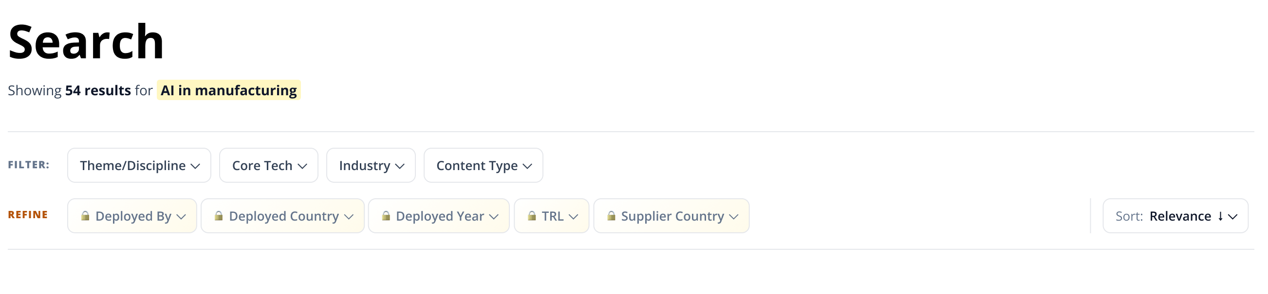
The search redesign is approved but still in engineering, so the win here is the onboarding and auth work, not the filters yet. I should have shipped the smallest slice of the new search sooner to test the thesis with real traffic instead of holding the whole redesign.
The deployment-proof view still gates almost everything behind a plan. Turning 'Deployed by 1 company' into a real credibility signal meant surfacing aggregate counts and sectors up front and moving the lock onto the specifics, but I stopped short of pushing that all the way into production.
And I leaned on stakeholder reports for the bounce and demo numbers rather than instrumenting the funnel myself. Next time I'd wire the events first, so the before/after is mine to prove, not something I have to take on trust.